We’ve already covered how to create animated buttons, but if you’re looking to take your button animations and animation functionality to the next level, you’ll want to take a look at this tutorial that demonstrates how to make stylish download buttons that utilize smooth CSS animations.
The HTML
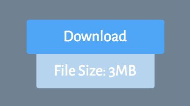
The download button has two parts — the button itself, and the tab that will appear under the button whenever the user hovers over it. Your HTML will need to account for both of these components. Here’s how it should look:
<a href="" class="download">Download</a>
<a href="" class="download bottom">File Size: 8MB</a>
Of course, the secondary tab (with the class “download bottom”) can say whatever you like. Keep in mind, however, that it does prove to be more aesthetically pleasing to have the secondary tab smaller than the button itself, so you might want to keep the content of the second tab short and to the point.
The CSS
Styling the button and the secondary tab is fairly easy and doesn’t require an excessive amount of CSS. Take a look at the code below to see for yourself.
body{
    font-family: 'Alegreya Sans';
    background: #708292;
}

a.download{
    text-decoration: none;
    color: #fff;
    background: #50a6f6;
    padding: 8px 10px;
    border-radius: 3px;
    display: block;
    width: 120px;
    margin: 100px auto 0 auto;
    text-align: center;
    z-index: 100;
    transition: opacity .8s ease;
}

a.download.bottom{
    width: 100px;
    background: #b7d4ee;
    opacity: 0;
    margin-top: 0px;
}

a.download.bottom{
    border-radius: 0 0 3px 3px;
}
As you can see, we make the secondary tab (a.download.bottom) invisible by giving it an opacity of 0. We also apply a transition effect to the primary button so that when the hover effect takes place, it happens with a nice smooth transition. This is what our button should look like at this point:

We’re only one like of CSS away from finishing the simple, sleek button. What’s missing is the instructions that will allow the secondary button to appear below the primary button when it’s hovered upon — basically, what’s missing is a hover effect.
The CSS code for the hover effect should look like this:
a.download:hover + .bottom{
    opacity: 1;
}
This code selects the secondary tab, but it only applies when the primary button is hovered upon. By changing the opacity from 0 to 1, it allows the secondary tab to appear smoothly (thanks to the transition effects we added before) whenever the primary “Download” button is hovered upon.
Here is what your button should look like at any point that you hover over it:

As always, color, size, font-family, and shape can be totally customized to suit any project or theme. Play around with this snippet to really make the button your own.